Logo Design
Print
Digital
Signage
Collateral
To reflect a new business model, St John’s Community Care approached Tropic Studio to create a corporate identity that pays homage to their Greek heritage, while radiating hope and prosperity within the community.
Logo Design
Print
Digital
Signage
Collateral
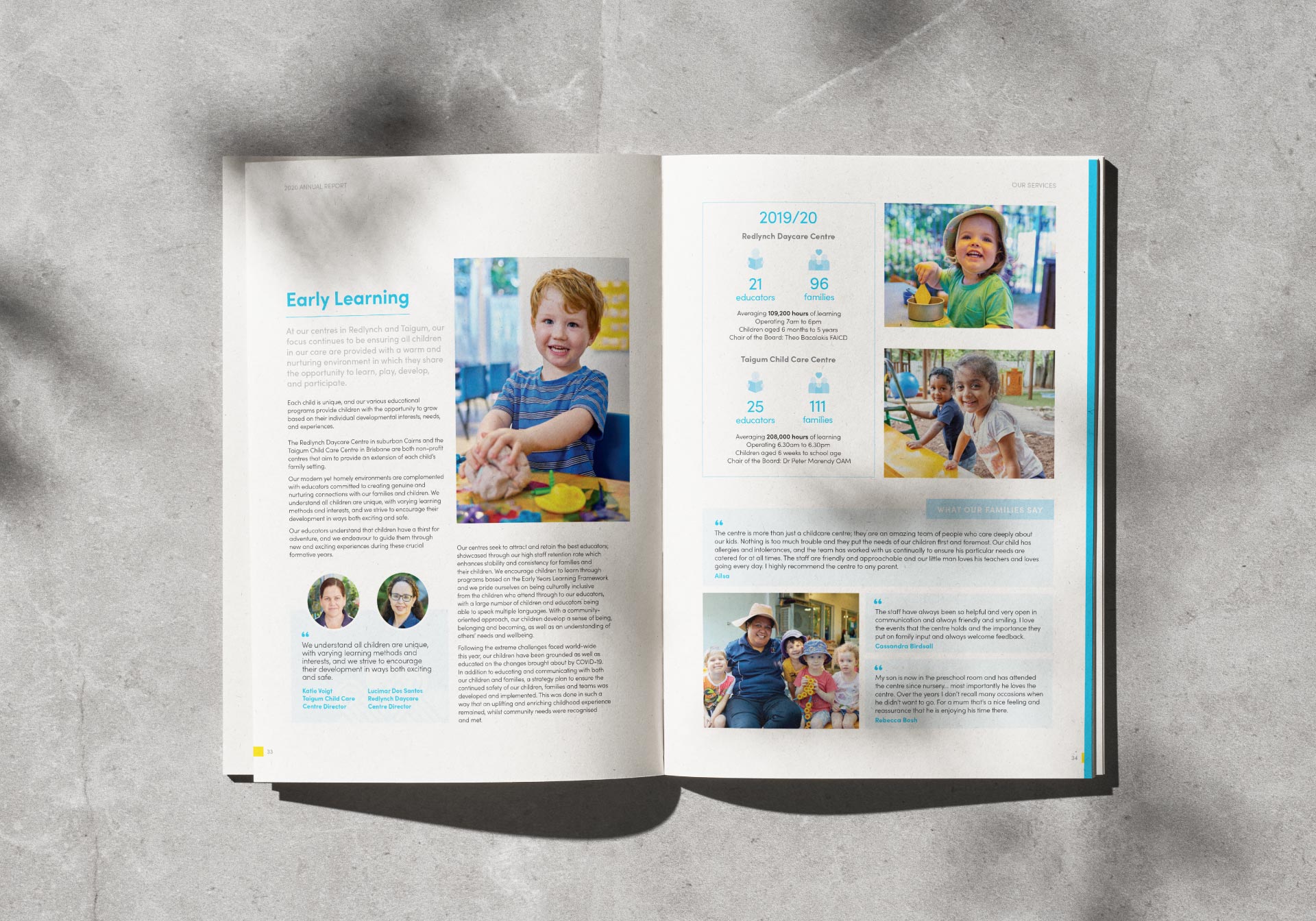
St John's Community Care is a not-for-profit community care organisation with more than 400 staff working in nine locations across Queensland.
With an extensive head office redevelopment and new service delivery model, we began by assessing how their current brand represented recent organisational changes in the rapidly evolving industry landscape.
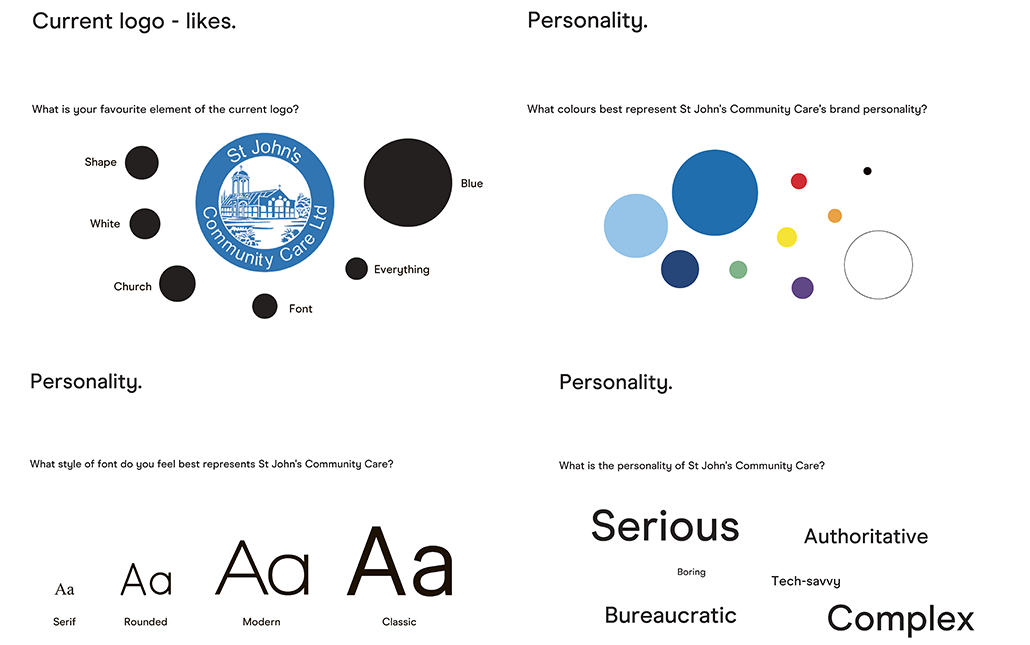
Our team started the process with an extensive brand audit and survey of the board, staff, and stakeholders and found the original SJCC logo had served the organisation well, but didn’t convey the new service model.
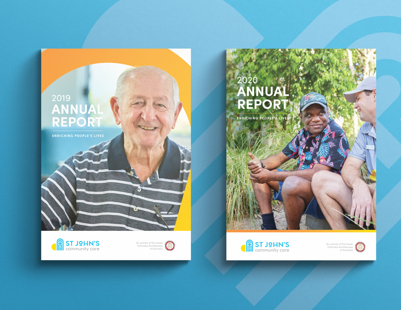
We therefore created a new organisation brand and colour scheme for roll out across a range of locations, platforms, and media.
Our brand audit and survey had two key outcomes.
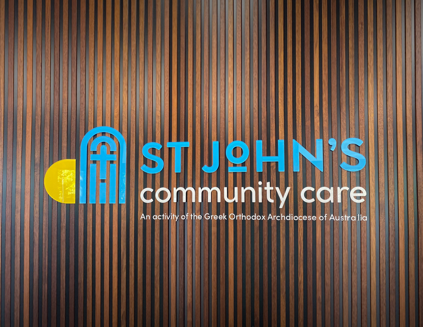
1. The colour blue is integral to the SJCC identity and identifies strongly with Greek culture.
2. The bell tower of the church is iconic and speaks to the organisations heritage.
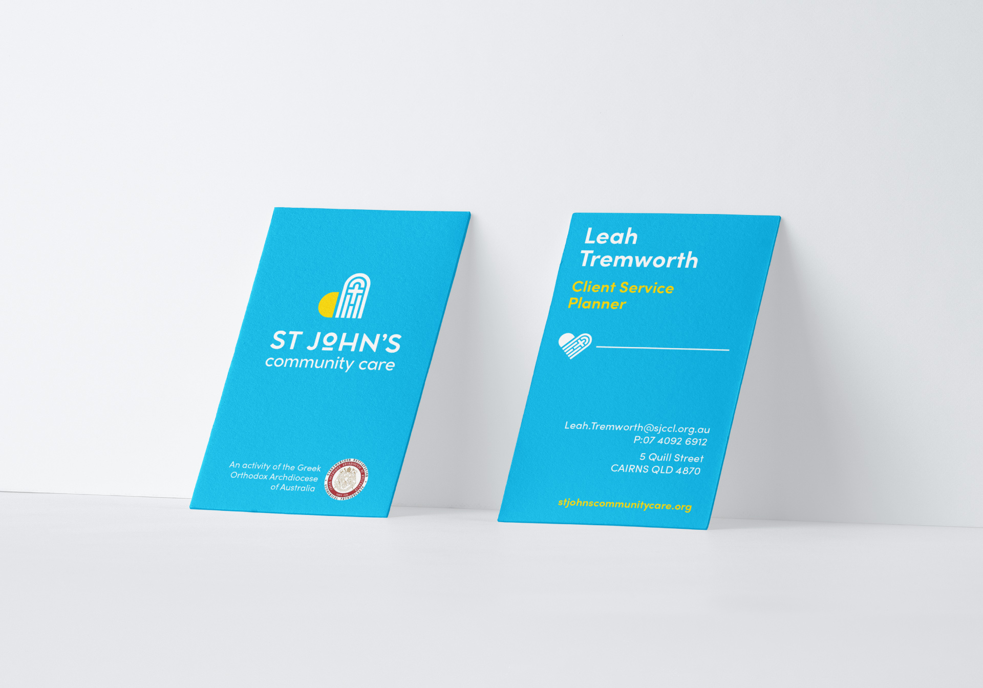
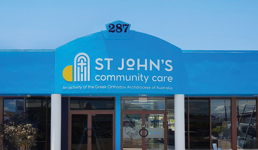
Utilising the findings, we created a logo that embraces the iconic shape of the parish bell tower, paying homage to SJCC’s past while affirming the beliefs and faith of the organisation.
The typography is clean and fresh, looking to the future but with a historical Greek reference in the modern take on Omega being the “o” in St John’s. The pop of colour is the rising sun, lighting the bell tower and shining light on the organisation.
When viewing the elements of the new logo together, a heart shape becomes obvious, indicating the care and love of SJCC for the community.
The heart becomes visible across much of the client’s collateral, letting a wider audience know that SJCC at its essence is a care organisation.
This translated well across collateral, including signage, marketing and advertising, websites, stationary, and uniforms.