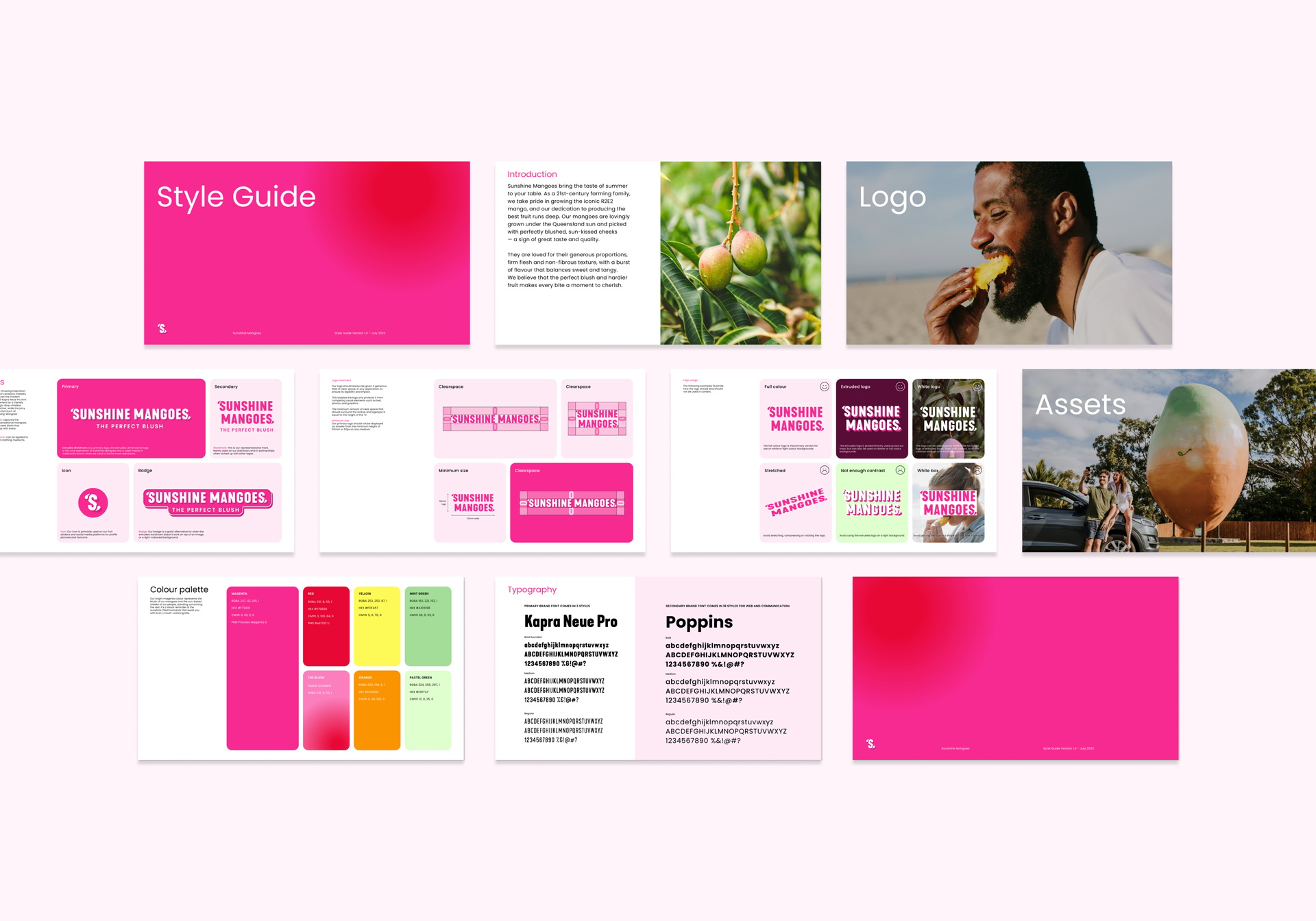
Brand
Logo Design
Packaging
Print
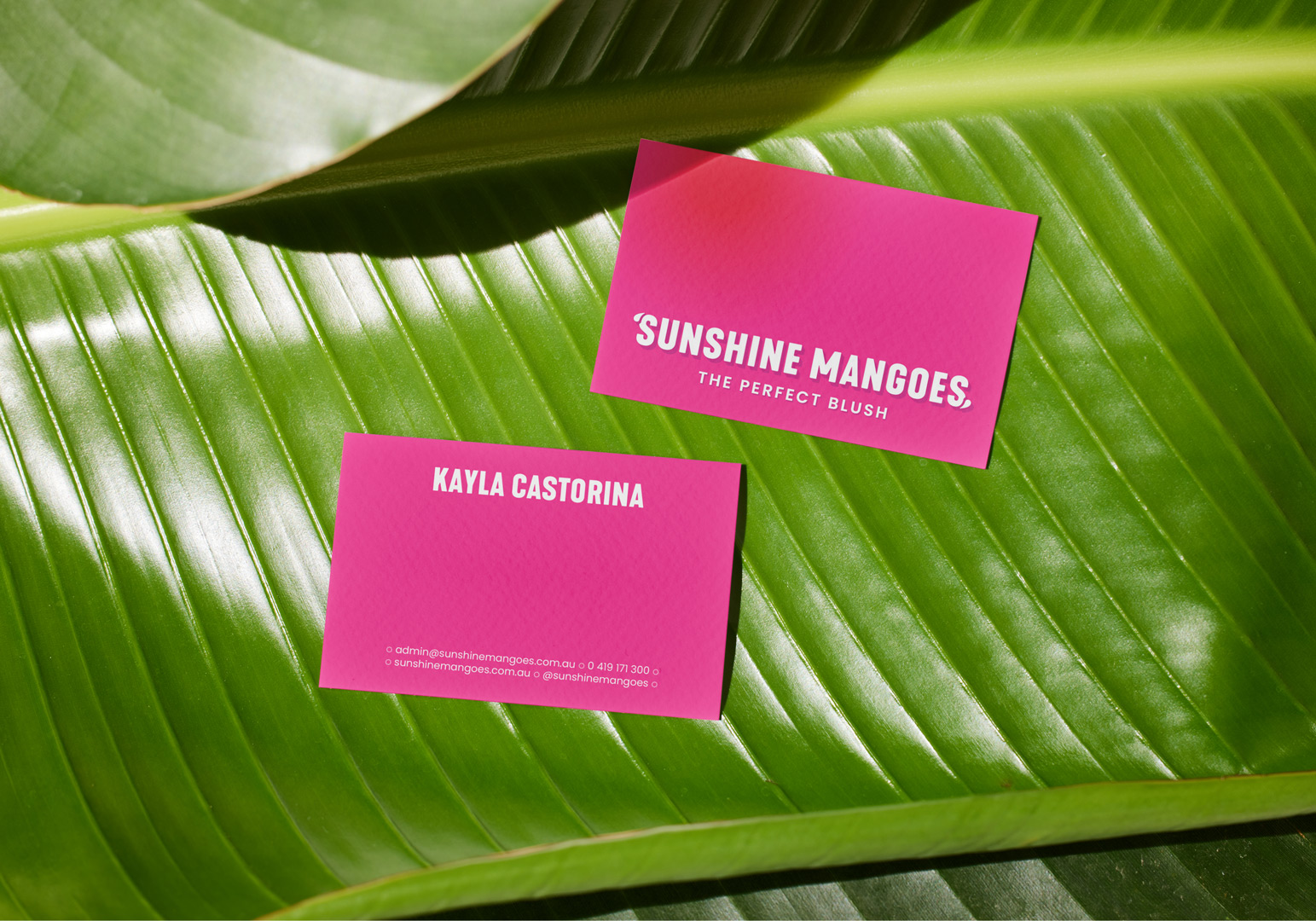
We worked closely with the Castorina family to deliver a brand new identity inspired by the blush of their mangoes.
Brand
Logo Design
Packaging
Print
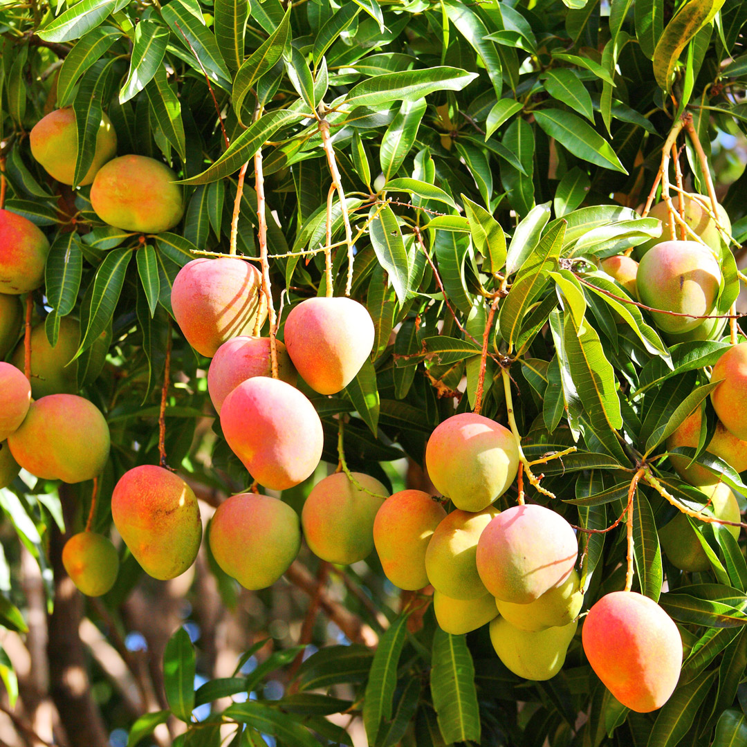
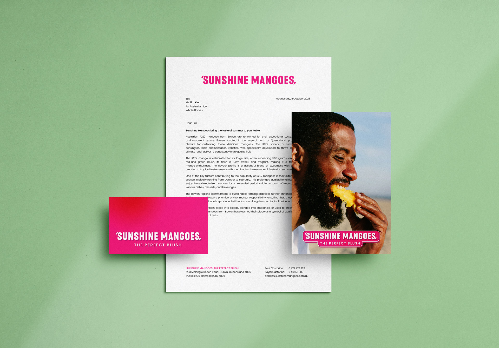
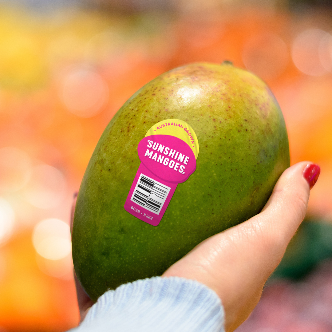
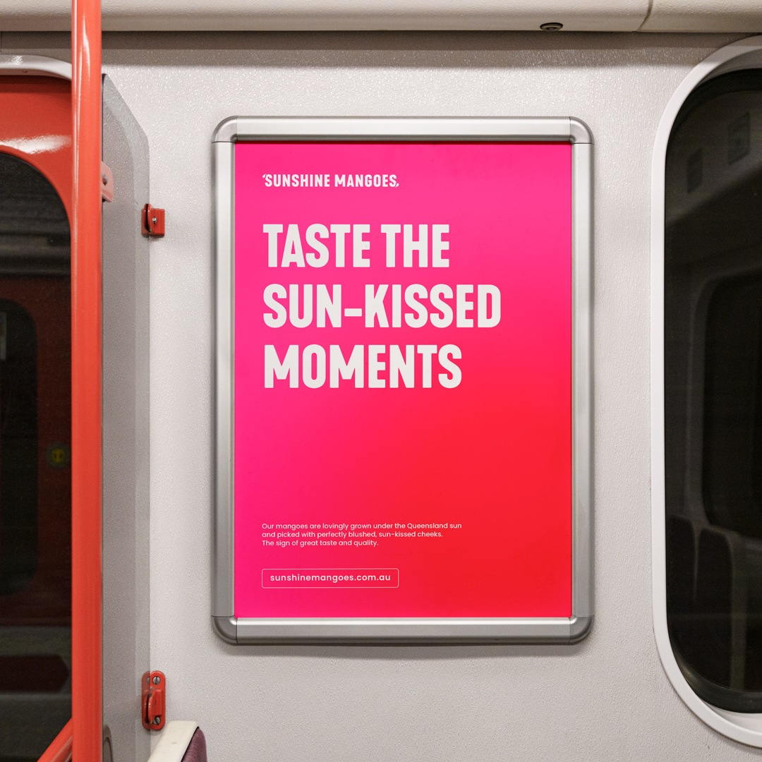
Lovingly grown under the Queensland sun and picked with perfectly blushed sun-kissed cheeks, Sunshine Mangoes make every bite a moment to cherish. Kayla and Paul Castorina are third-generation mango farmers from one of the main mango production regions in Queensland, and the new custodians of the family business. We helped them take the family business forward by developing a dynamic and fresh visual identity that works across digital media and packaging.
Drawing inspiration from Queensland’s produce markets, the design features a Grotesque Sans Serif typeface. The quenching drops also add a playful touch of flavour, while the magenta colour sets the tray apart from other growers, brightening up the fruit aisle and complimenting The Perfect Blush.
By creating a distinctive brand, Paul and Kayla can now tell the story of the product’s origin, the family farm, their commitment to quality Australian-grown produce and sustainable regional communities.
During the discovery phase, we explored mango trays and trends from the past that have influenced the industry as we know it today.
Image credit: Cartonographer